

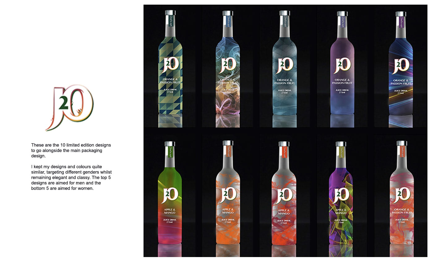
J20 Rebrand
(part of YCN Competition 2015)
Aim: To redesign and relaunch a new packaging design for J20. The aim is to target a wider audience, especially adults who are in some ways embarassed to be seen drinking a J20 as it looks childish.
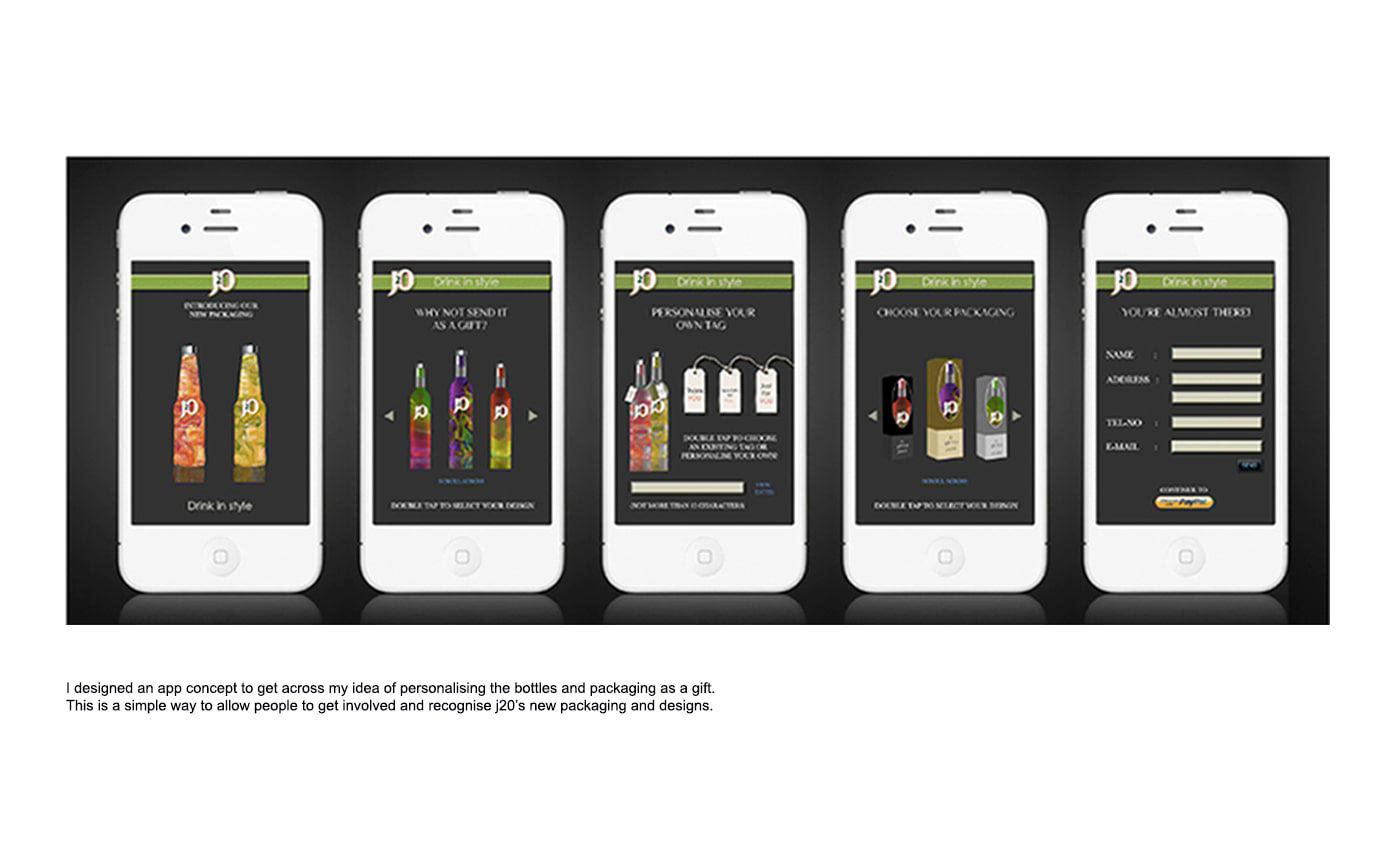
Concept: A new range of bottle designs and packaging which are classy an elegant - also including limited edition bottles which are aimed to please both men and women. To push the campaign further, I also designed a mini booklet showing "20 ways to drink J20" which are new and fun ways to drink J20. There are also party cards which shows how J20 can be used as mixers to create classy cocktails. This idea is just to push J20 out there as a versatile drink which can be used for different purposes on different occasions.


20 WAYS TO DRINK J20 LOOKBOOOK


